

Test news post

This is a sample article for testing how longer news content appears on the SoundSmiles website. It is not an official project update. The aim is to see how the page handles several paragraphs, how comfortably the text can be read, and how the article looks alongside its cover image.
A news page should feel easy to follow from the first sentence to the last. Readers might arrive using a phone, a tablet, or a desktop computer, so this example includes paragraphs of different lengths. As you preview it, notice whether the lines feel too wide, whether the spacing gives each paragraph enough room, and whether the title remains clearly separated from the body.
You can also use this draft to experiment with the editor. Try making a short phrase bold, adding a link, or turning a sentence into a heading. These changes should help organise the article without distracting from its main message. A small list could be useful when sharing several related points, while ordinary paragraphs usually work best for a continuous story.
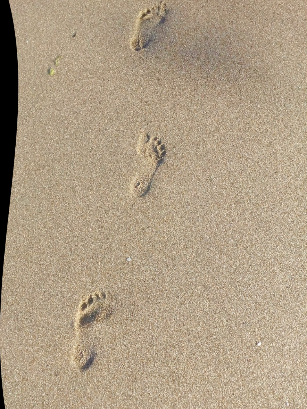
The cover image is another part of the reading experience. Check how it appears on a narrow screen and whether its crop keeps the important subject visible. Its alternative text should describe what is actually shown, rather than repeat the article title or use the image’s filename. If you add another image inside the body, give that image its own description too.
Finally, scroll through the complete article and return to the news listing. Does the card title make sense? Is the full article comfortable to read? Try adjusting a paragraph in Studio, publishing the change, and refreshing the page. Once you have finished experimenting, this sample can be unpublished or replaced with approved content. Keep it clearly labelled while testing so nobody mistakes it for a genuine announcement.